When someone clicks on an ad or promotion, the landing page decides whether they buy or leave. I’ve noticed that many e-commerce stores send traffic to regular product pages that aren’t designed to guide visitors toward a clear action.
Even small improvements can make a big difference. Google reports that improving mobile page speed by just 0.1 seconds can increase conversion rates by up to 8% for retail sites.
In this guide, I’ll walk through the best practices for e-commerce landing page optimization and how to structure pages that encourage visitors to take action.
What Is an E-commerce Landing Page?
An e-commerce landing page is a standalone page designed to encourage visitors to take a specific action, usually making a purchase. Unlike regular product pages that allow users to browse multiple products, a landing page focuses on a single offer or campaign.
I usually think of it as a conversion-focused page where everything, the headline, product details, visuals, and call-to-action, is designed to guide visitors toward buying the product.
For example, if I’m promoting a skincare product through ads, I’d send visitors to a dedicated landing page explaining the benefits of that product instead of a general product catalog.
Why E-commerce Landing Pages Matter for Conversions
They focus visitors on one clear action. Unlike regular product pages that include multiple links and navigation options, e-commerce landing pages guide visitors toward a single goal, such as making a purchase.
They match the intent of marketing campaigns. When someone clicks an ad or promotion, a dedicated landing page can continue the same message and offer, making the experience more relevant.
They reduce distractions. By removing unnecessary navigation and extra options, landing pages keep visitors focused on the product or offer being promoted.
They improve conversion potential. A page designed specifically for one offer makes it easier for visitors to understand the value of the product and take action.
They maintain message consistency between ads and landing pages. When the message on the page matches the ad that brought visitors there, they are more likely to stay engaged and complete the purchase.
According to Unbounce, the average landing page conversion rate across industries is about 9.7%, showing how optimized landing pages can significantly improve performance compared to generic pages.
Best Practices for E-commerce Landing Page Optimization
1. Remove Navigation and Minimize Distractions
One of the most important principles of e-commerce landing page optimization is reducing distractions. When visitors arrive on a landing page, the goal is to guide them toward one specific action, usually making a purchase.
Including a full website navigation menu or multiple external links can easily pull visitors away from that goal. I usually remove the main navigation and limit the number of clickable elements so visitors stay focused on the offer.
Instead of encouraging browsing, the page should direct attention to the product, its benefits, and the call-to-action. This keeps the experience simple and increases the chances of conversion.
2. Use a Clear and Visible Call-to-Action
Every e-commerce landing page should make it obvious what the visitor needs to do next. A clear call-to-action (CTA) helps guide visitors toward the main goal of the page, whether that’s buying a product, starting a trial, or signing up.
I usually place the main CTA button in a visible spot, often near the top of the page, so visitors can immediately take action without searching for it. The button text should also be direct and action-focused, such as “Buy Now,” “Get Started,” or “Order Today.”
Keeping the CTA clear and easy to find helps reduce confusion and encourages visitors to complete the intended action.
3. Place Multiple CTAs With the Same Goal
While a landing page should focus on one main goal, that doesn’t mean you should include only one CTA button. I usually place multiple CTA buttons throughout the page so visitors can take action whenever they’re ready.
For example, a CTA can appear near the top of the page, after explaining the product benefits, and again near the bottom. Each button should lead to the same action, such as “Buy Now” or “Order Today.”
This approach makes it easier for visitors to convert without having to scroll back up to find the next step.
4. Write a Clear Product Description Above the Fold
Visitors should quickly understand what the product is and why it’s valuable as soon as they land on the page. I usually place a short and clear product description above the fold so people don’t have to scroll to understand the offer.
This section should highlight the main benefit of the product and explain what problem it solves. Keeping the description concise and easy to read helps visitors decide whether they want to learn more or take action.
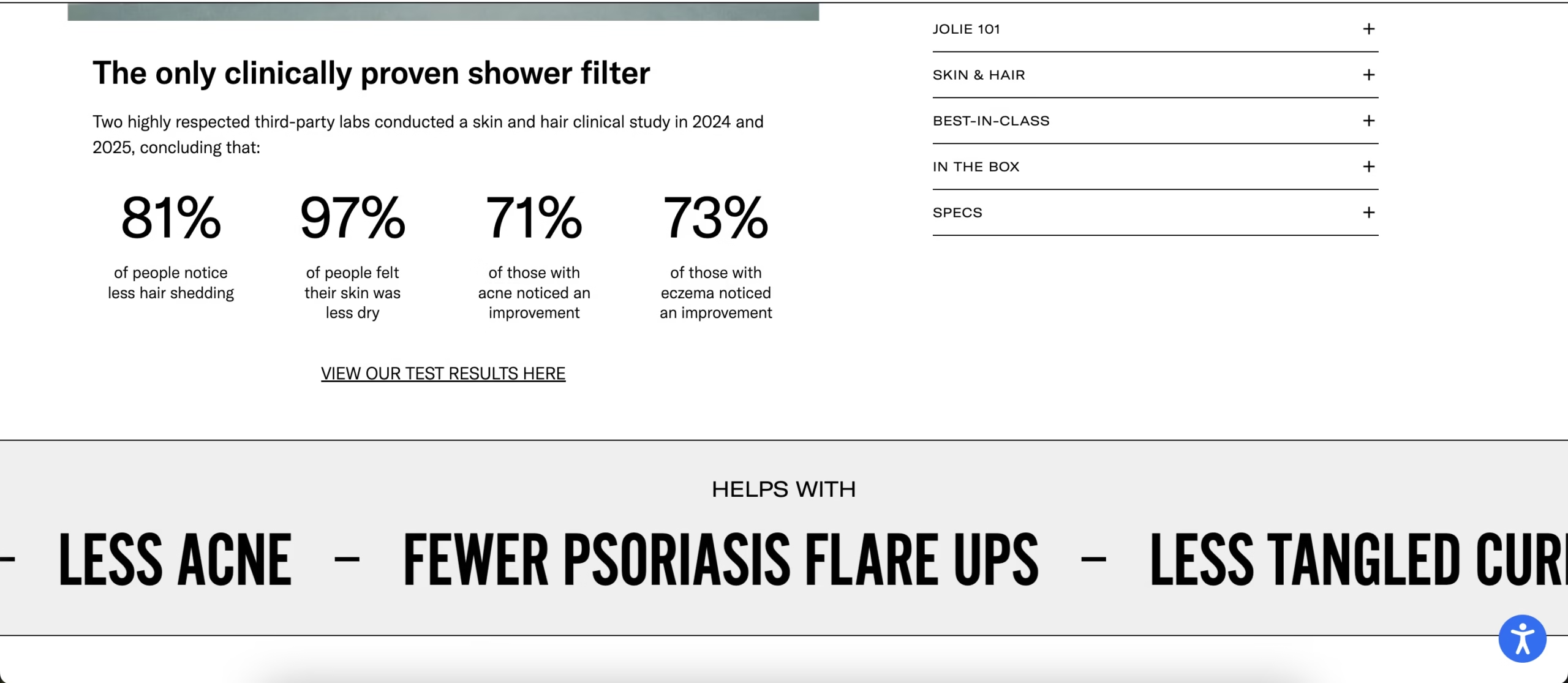
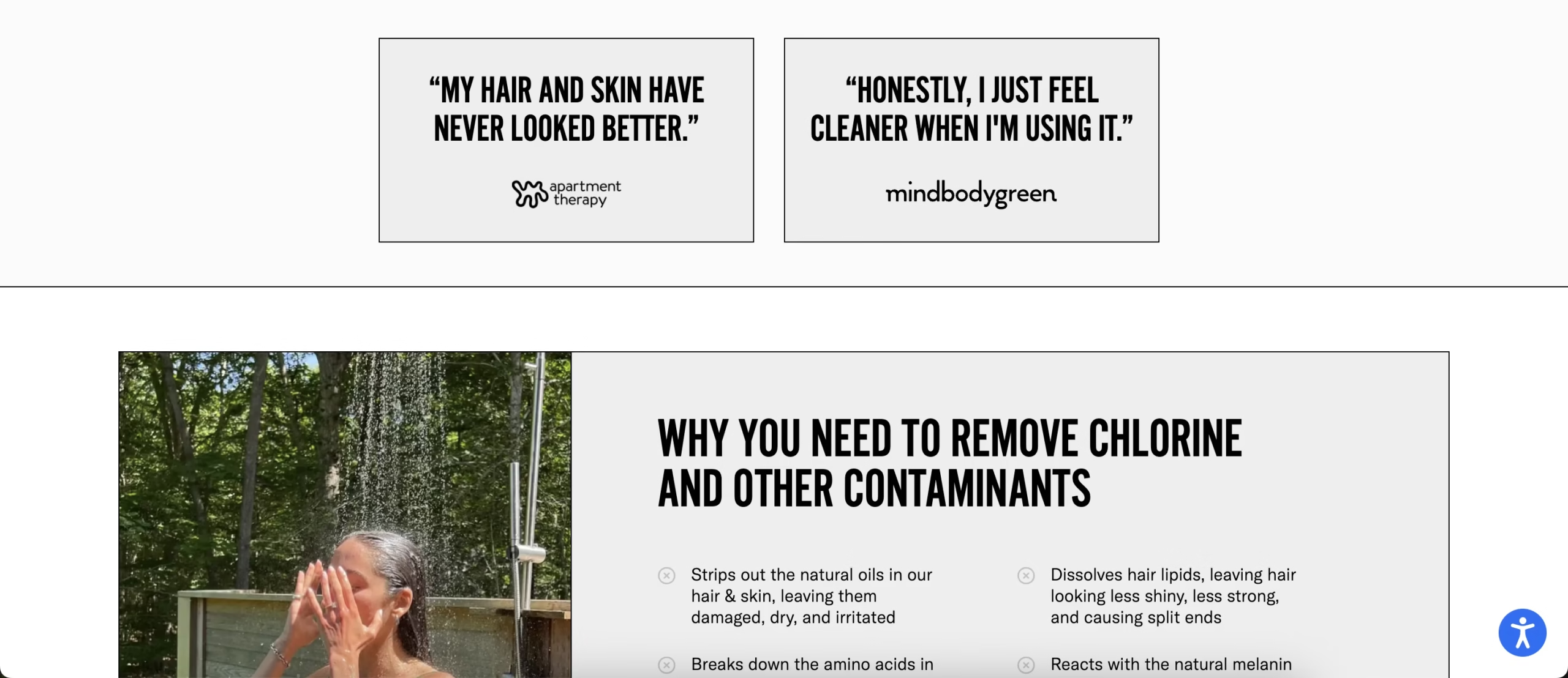
5. Use Social Proof and Trust Signals
People are more likely to buy when they see that others trust the product. That’s why I usually include social proof on e-commerce landing pages to build credibility and reduce hesitation.
This can include customer reviews, testimonials, product ratings, or trust badges. These signals reassure visitors that the product works and that other customers have had positive experiences.
Placing social proof near the product description or close to the call-to-action can help reinforce trust right when visitors are deciding whether to make a purchase.
6. Focus the Page on One Conversion Goal
An effective e-commerce landing page should be designed around a single conversion goal. When a page tries to promote multiple offers or actions, visitors may become confused about what they are supposed to do next.
I usually keep the goal simple, such as buying a product, starting a free trial, or signing up for an offer. Every element on the page, including the headline, product description, visuals, and CTAs, should support that one objective.
Keeping the page focused helps reduce decision fatigue and makes it easier for visitors to complete the intended action.
7. Optimize E-commerce Landing Pages for Mobile
Many shoppers now browse and buy products from their phones, so mobile optimization is essential for e-commerce landing pages. If a page is difficult to navigate on a small screen, visitors are more likely to leave before completing a purchase.
I usually make sure the layout is simple, the text is easy to read, and the buttons are large enough to tap comfortably. Images and videos should also load quickly and fit properly on mobile screens.
A fast, mobile-friendly landing page improves the user experience and makes it easier for visitors to complete the purchase.
8. Improve Page Load Speed
Page speed plays a major role in e-commerce conversions. If a landing page takes too long to load, visitors may leave before they even see the offer.
I usually improve page speed by compressing images, reducing heavy scripts, and limiting unnecessary plugins. Keeping the landing page lightweight helps it load faster, especially on mobile devices.
A faster page improves user experience and increases the chances that visitors stay on the page and complete a purchase.
9. Match the Landing Page With the Ad Message
One important best practice I follow is making sure the landing page matches the message used in the ad. When visitors click an ad, they expect the page they land on to continue the same promise or offer.
For example, if an ad promotes “20% off a skincare product for sensitive skin,” the landing page should highlight that exact offer and benefit immediately. If the page instead shows a general product catalog or a different promotion, visitors may feel confused and leave the page.
Keeping the headline, visuals, and offer consistent with the ad helps create a smoother transition. When visitors instantly recognize that the page matches what they clicked on, they are more likely to stay and complete the purchase.
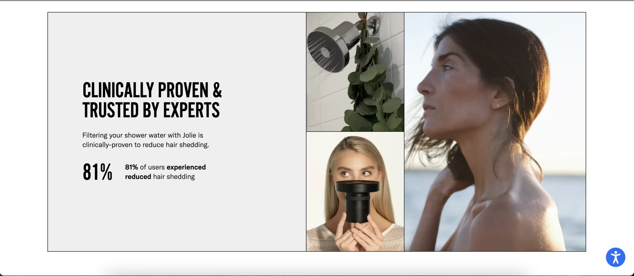
10. Use High-Quality Product Images and Videos
Since customers cannot physically see or touch a product online, visuals play a major role in influencing purchase decisions. High-quality images and videos help visitors better understand the product and imagine using it.
I usually include multiple product images, close-up shots, and sometimes short demonstration videos to show how the product works. For example, a skincare landing page might include before-and-after photos, application videos, or images highlighting key ingredients.
Clear visuals make the product feel more tangible and reduce uncertainty for shoppers. When visitors can easily see the product details and how it’s used, they are more likely to feel confident about completing the purchase.
Example of an E-commerce Landing Page
A good real-world example of this approach is the Jolie Filtered Showerhead landing page. Instead of sending visitors to a general product catalog, Jolie directs traffic to a dedicated landing page focused entirely on one product.
The page highlights the main benefits of the showerhead, shows customer reviews, and includes clear “Buy Jolie” calls-to-action throughout the page. By removing unnecessary navigation and focusing on a single offer, the page keeps visitors focused on completing the purchase.
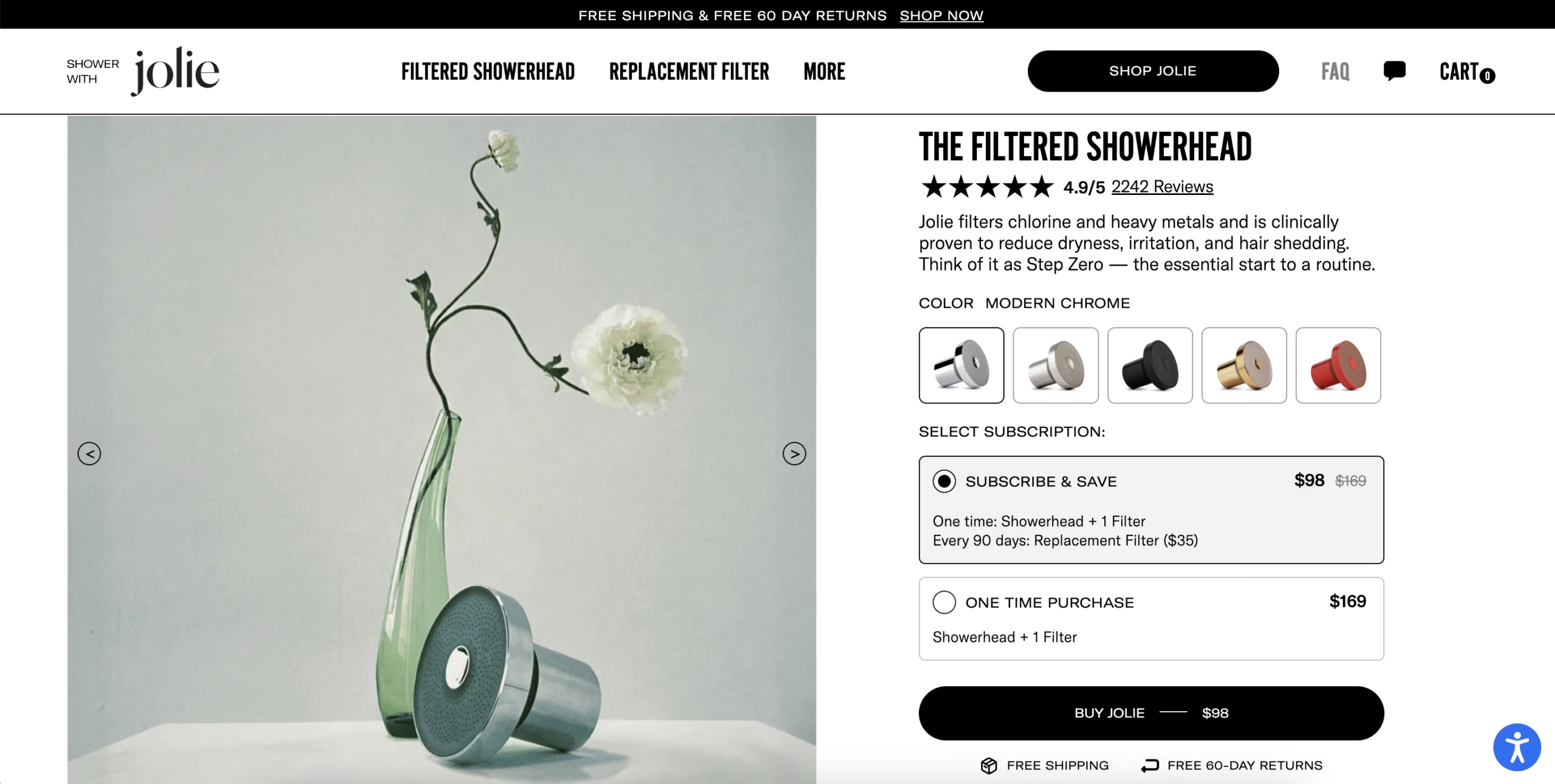
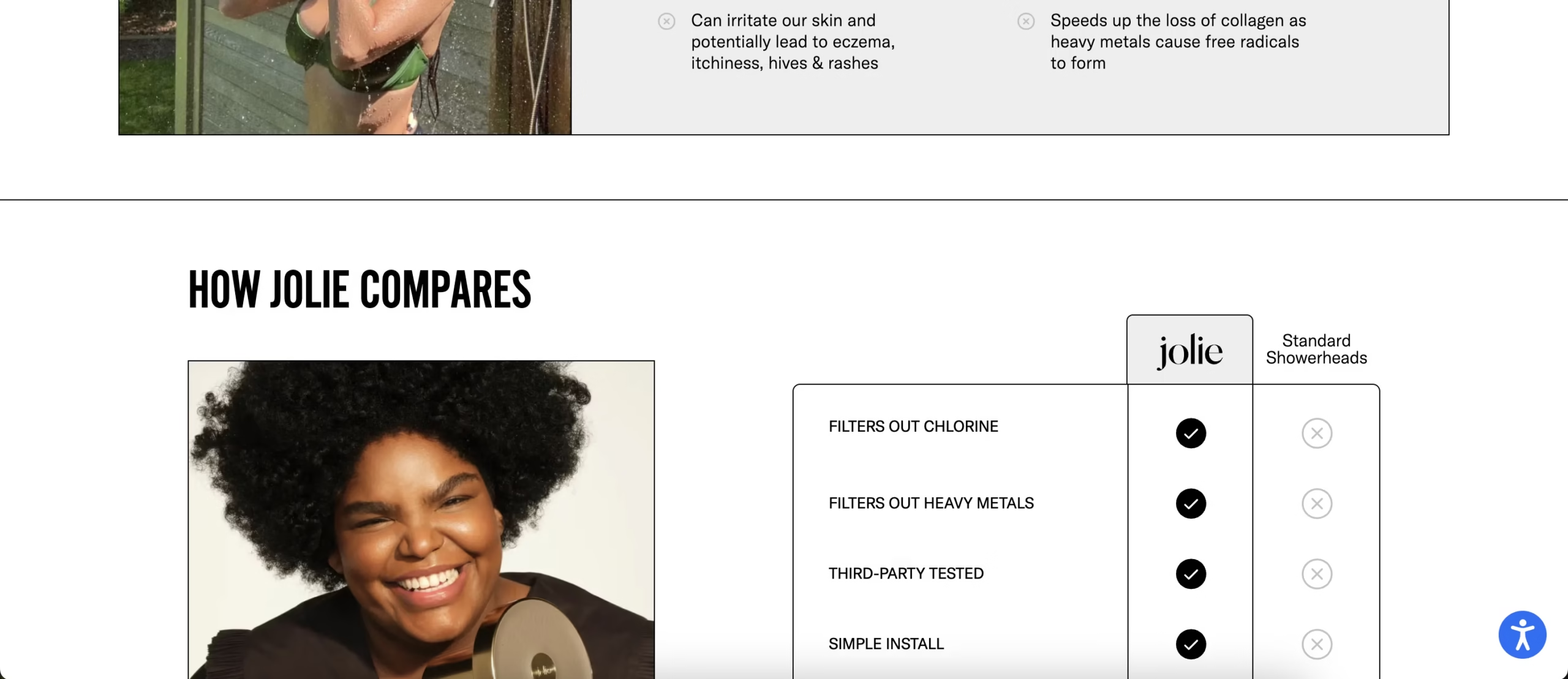
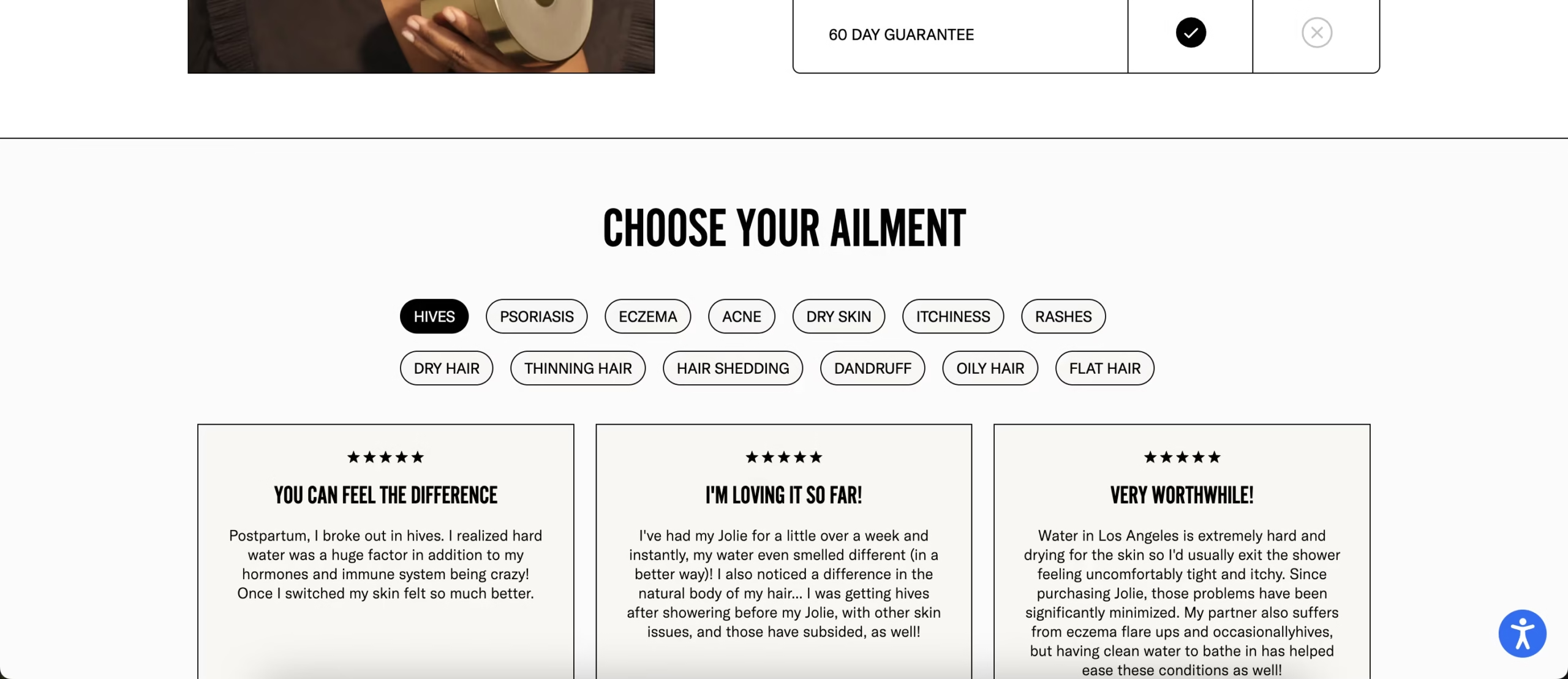
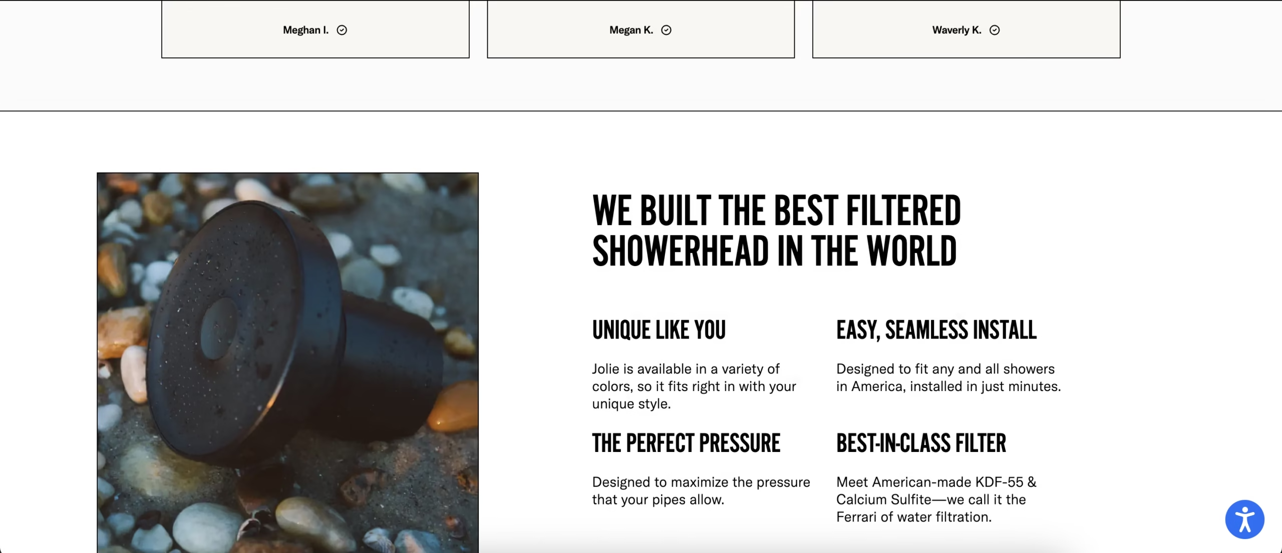
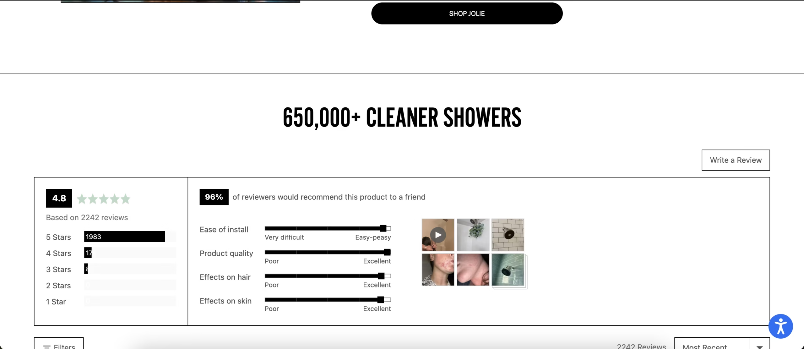
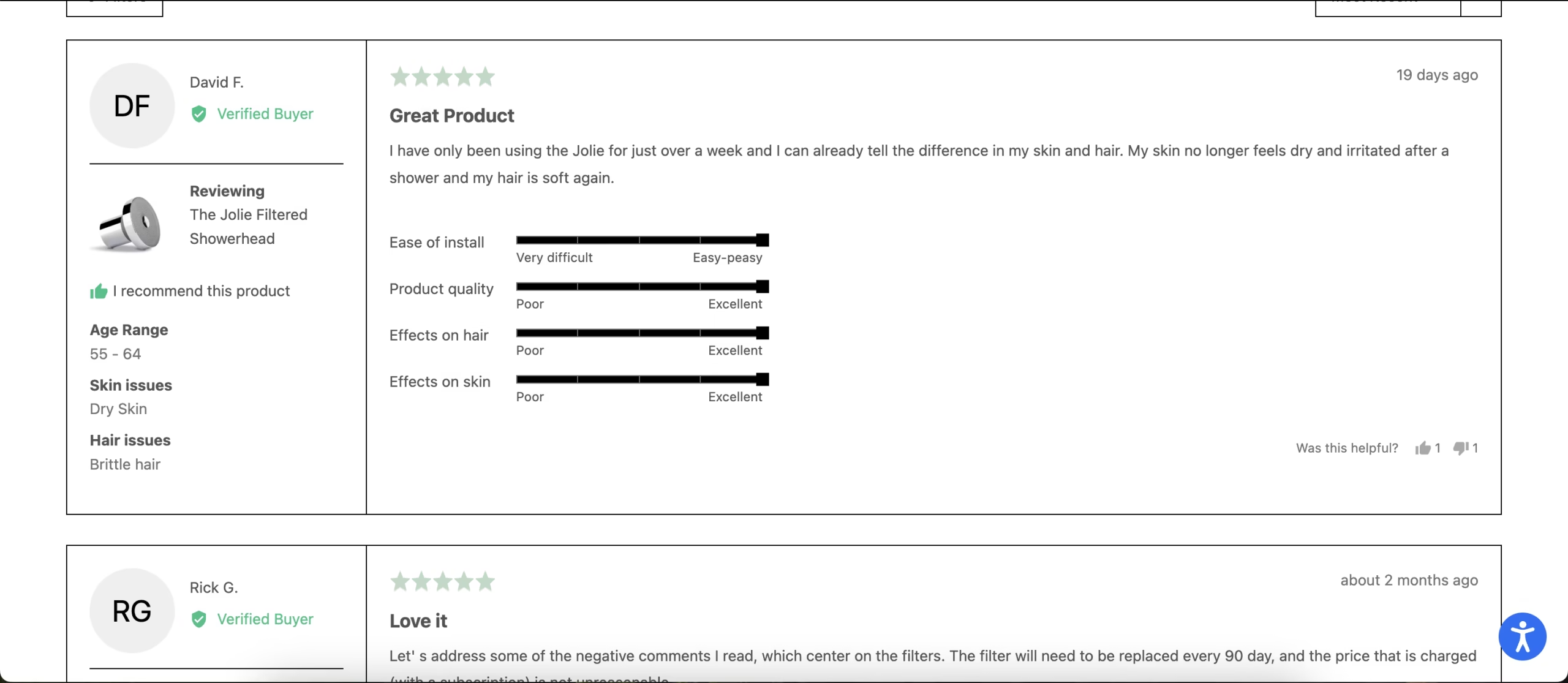
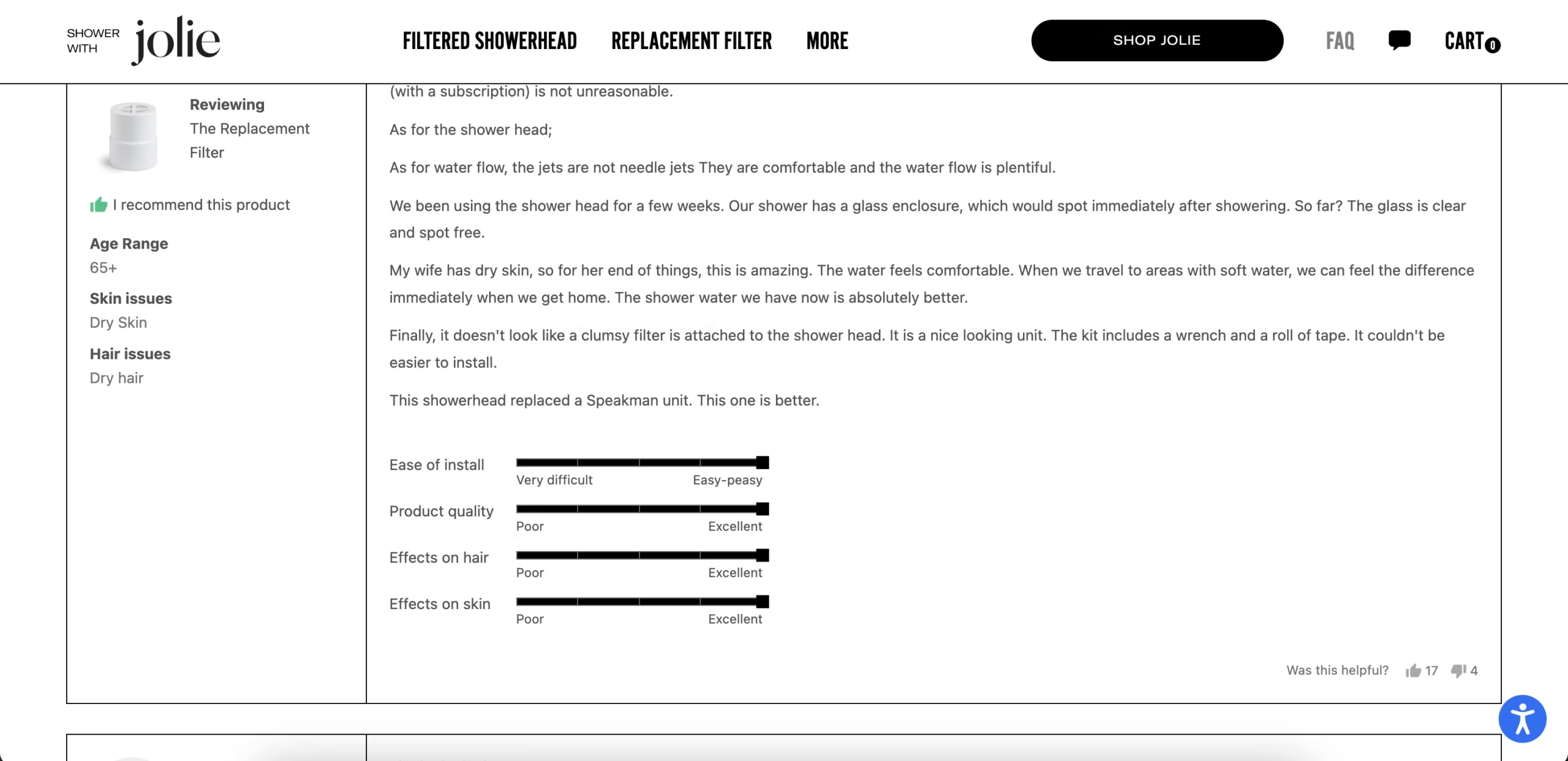
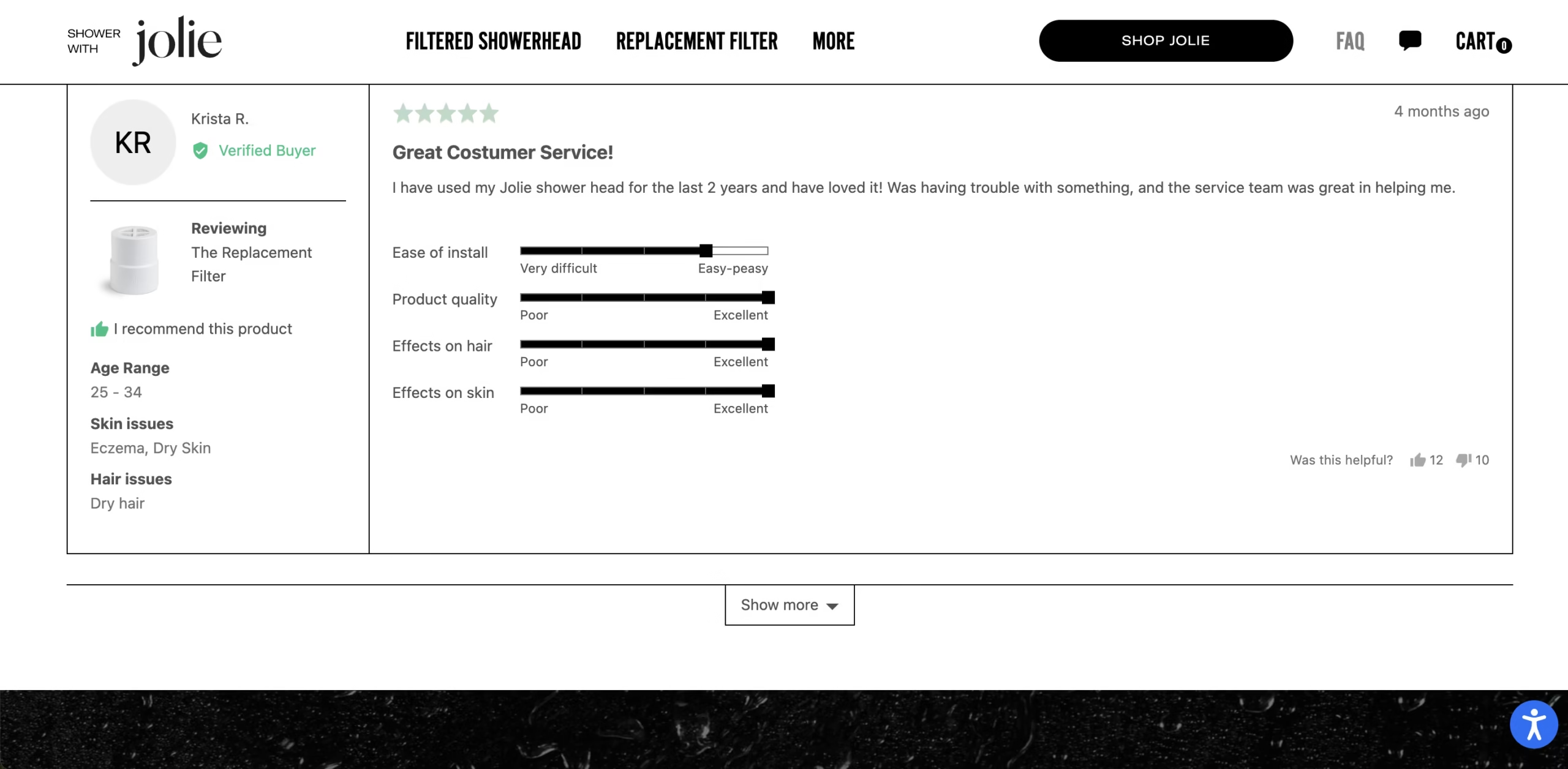
This type of focused landing page is commonly used in e-commerce campaigns to guide visitors from interest to purchase without distractions.
Conclusion
Optimizing an e-commerce landing page is all about guiding visitors toward a clear action. By reducing distractions, writing clear product descriptions, using strong calls-to-action, and adding trust signals, it becomes easier for shoppers to move from interest to purchase.
Even small improvements in page structure and user experience can make a noticeable difference in conversions. When each element of the page supports a single goal, e-commerce landing pages become far more effective at turning visitors into customers. Following these best practices for e-commerce landing page optimization can help improve conversions and create a smoother shopping experience.
Frequently Asked Questions
What is an e-commerce landing page?
An e-commerce landing page is a standalone page designed to encourage visitors to take a specific action, usually purchasing a product or signing up for an offer.
How is a landing page different from a product page?
A landing page focuses on one offer or campaign and guides visitors toward a single action, while a product page often allows users to browse multiple products and navigate other parts of the website.
What makes a high-converting e-commerce landing page?
A high-converting landing page usually includes a clear headline, persuasive product description, strong calls-to-action, trust signals like reviews, and a simple layout that reduces distractions.
Should e-commerce landing pages remove navigation?
In many cases, removing navigation helps keep visitors focused on the main goal of the page. This reduces distractions and increases the chances of conversion.
Why is mobile optimization important for e-commerce landing pages?
Many online shoppers browse and purchase products on mobile devices. A mobile-friendly landing page improves user experience and makes it easier for visitors to complete a purchase.
How is an e-commerce landing page different from a homepage?
A homepage introduces the entire store and allows visitors to browse multiple products. An e-commerce landing page focuses on one product or offer and guides visitors toward completing a specific action.